
The Design and the Designer behind the Vire Clip
Mika Nenonen has spent twenty five years turning difficult technologies into objects people will actually wear and his method is subtraction: remove everything inessential until only the parts that make the product work remain. Asked about the Vire Clip he designed over three years, he gives away the credit, and admits the only thing he really wants to know is whether people will wear it.
Mika Nenonen has been an industrial designer for twenty five years, and in all that time he has designed exactly one kind of thing.
.jpeg)
Oura. Google. Suunto. He arrives at the point where a difficult technology has to stop being a technology and become an object somebody will put on their body every day, and he has arrived at that point more often than almost anyone.
Three Red Dot awards, an iF Gold, a D&AD Yellow Pencil, a UNESCO top ten. He mentions none of it. Asked to introduce himself he says he is a quite senior industrial designer who has been doing this for a very long time, and leaves it there.
What follows is how he came to Vire, what he decided the clip was, and why he has already stopped looking at it.
One coffee in San Francisco
How he came to Vire is a chain of small coincidences, and it only makes sense read in order.
He had just started working for himself and was living in San Francisco. A classmate from his school days in Finland was living there too. That classmate knew one of Oura's original founders, Petteri Lahtela, who was in town meeting investors. He also knew Mika was a few blocks away. So he suggested the two of them grab a cup of coffee, because Mika might be able to help with a ring.
Turn your phone sideways to follow the chain.
Remove any one link and the clip has a different designer.
He is careful about the credit. He was not the named designer of that first ring, but he worked through the concept development phases, drafting the form factor and the component layout alongside a mechanical engineer friend. He went back for a second stint years later. And when Antti Immonen was assembling a team for Vire, Petteri Lahtela recalled a guy he had met over coffee years back.
What made him say yes was that the form factor did not exist yet.
He adds a second reason, and it is the harder one to say out loud. Plenty of ideas fly around. Very few people can build a business around one. He believed this founder could.
A piece of jewellery worn under your clothes
Every product that works has one sentence underneath it that everything else obeys. For the Vire Clip the sentence was about jewellery, and it solved a problem most wearables never even attempt.
A device that reads core temperature needs volume, because volume is where the electronics live. Volume is also the thing that makes a wearable look like equipment. His answer was to put the volume where nobody looks.
Worn, almost all of the clip sits between your body and your underwear. The body holds the volume, the electrodes sit against the skin, and the hinge takes it onto the waistband. The one part anyone sees is the ring.
That ring is not a detail he is willing to let pass as a detail. It is the only visible element, which makes it the whole of the product's public face.
Once that sentence existed, the rest followed without much argument, including the materials. Asked how he chose them, he gave the least glamorous answer available.
A plastic body, because that is what a body is. Metal electrodes, because electrodes have to be metal. A metal ring, because only metal gives you that thinness. He points out there were no other options once the form factor was fixed, and then says something most designers would be too nervous to say out loud about their own work.
Why there is never just one
Colour is where a rigorously functional object finally gets to have an opinion, and it is also where the commercial reality is least romantic.
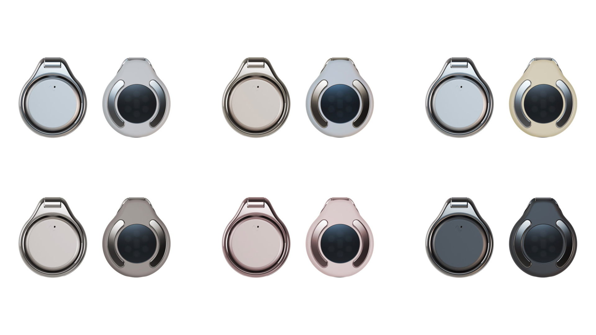
The family runs from neutral to expressive. Black and white are the anchors: timeless, easy to wear, and whatever else you put beside them, they are what most people end up choosing. Between them sit a soft nude pink, an earthy clay brown and a warm butter yellow, and their job is explicitly not to please everyone.
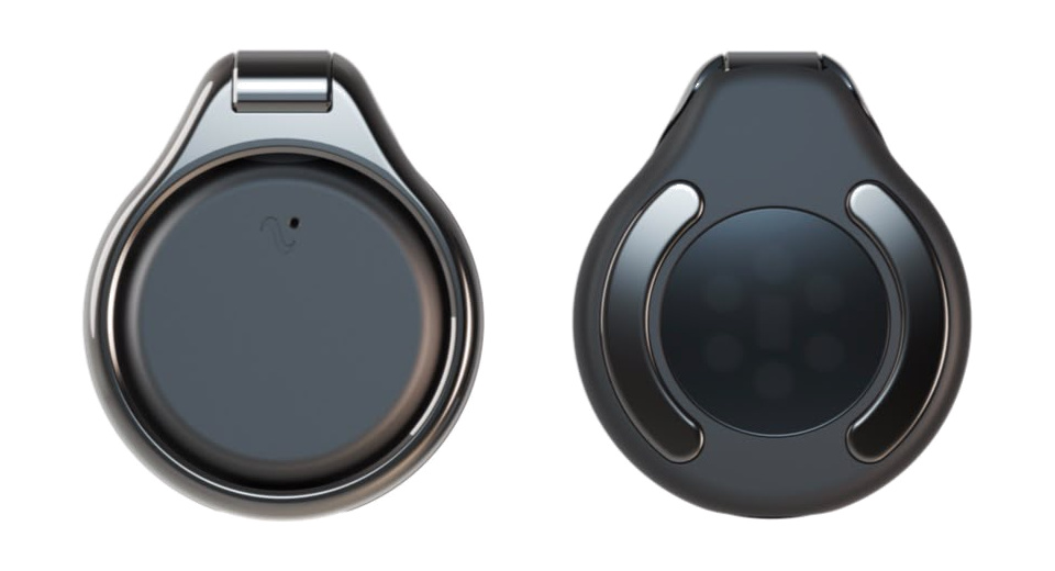 Blackgunmetal
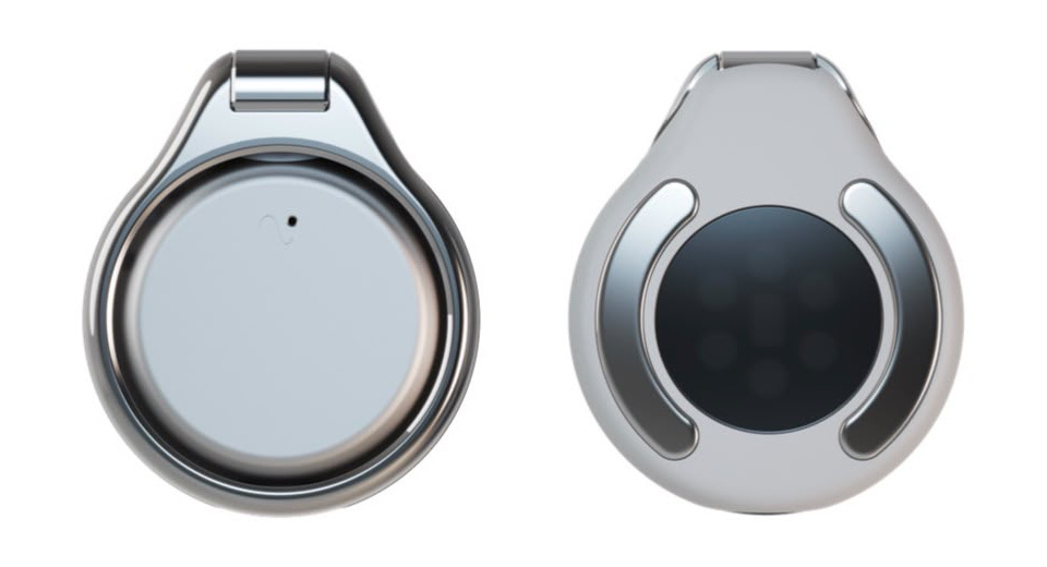 Whitesilver
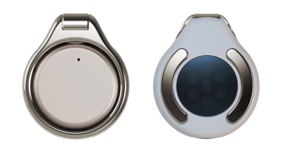 Whitegold
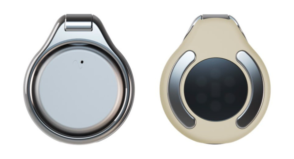 Buttersilver
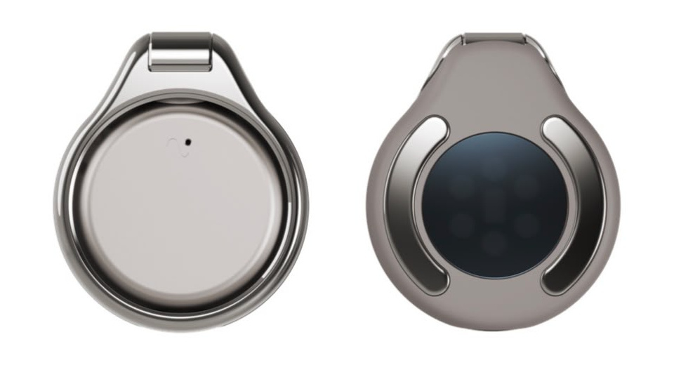 Claygold
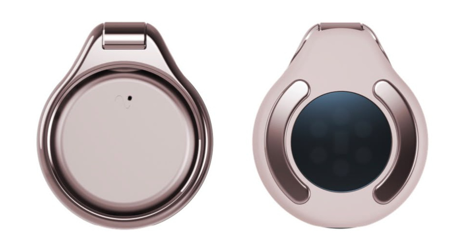 Nuderose gold
Six colourways. The body carries the colour, the ring carries the finish.
Each shade is carried by two different materials, and neither of them is painted. Nothing on the clip is. The plastic body is raw and uncoated, so the colour is in the material rather than on it, tuned shade by shade. The metal is finished with a PVD coating, an extremely thin metallic layer that leaves the character of the surface underneath intact.
This is the same instinct as the rest of his method, applied to finish. Paint is a layer you add in order to hide what is underneath. He would rather use materials with their own qualities and then not cover them. That is also why the jewellery idea holds: the ring keeps its metal, so light and shadow move across it, and a deliberately quiet product gets one small place where something happens. Neutral against expressive, soft polymer against reflective metal, hidden technology against visible jewellery. He calls those pairings the foundation of the whole colour and material strategy, and they are the same idea told three times.
What is missing from the family is a bright one, and he wants it. Something with punch, something sportier. He is also entirely realistic about how it would perform.
He makes the comparison to cars, where a satin olive green looks extraordinary and sells poorly, partly because buyers believe black holds its value. Black is always the safe one, he says, twice, in the way people repeat a thing they have watched happen for twenty five years.
The olive green that appeared in a recent community survey was not really a proposal for olive green. It was a probe, to see how people respond to muted earthy tones as a family. Asked which he would pick for himself, he ruled out black immediately, then white, and went for the bright one that does not exist yet.
He has already stopped looking at this one
Asked what he feels when he holds the finished clip, he checked whether he was allowed to be honest, and then was.
He loves seeing the first generation come to life. He is also, plainly, somewhere else. What he wants from the second generation is not a feature list. It is the same operation he has been running the whole time, applied again.
Simplification of everything. Smaller, the way technology products always get smaller. Possibly the hinge mechanism gone. And the jewellery idea carried forward and pushed further, while keeping the balance that matters most to him about it, which is that it stays approachable to men and women alike.
This is the thread that runs through everything he says, and he names it himself when asked whether his Nordic background shows in his work. He has spent years working with Asian companies too, and describes the two aesthetics as opposite extremes. One adds. The other removes.
Turn your phone sideways to watch it subtract.
His definition of the job, run once. He would tell you the second generation runs it again.
Ninety five per cent
At the end of the conversation, unprompted and after the thank yous had already started, he asked to add one more thing.
You can read that as modesty, and some of it is. But it is also consistent with everything else he does. A man whose entire method is removing whatever is not essential, asked to describe his own contribution, removes himself.
He is generous about his collaborator in a specific way, too. What he admires is not certainty but its opposite. Antti is not fixed on one thing, he says, but a curious sort who keeps learning and then revises the vision to match, which meant the target moved throughout the three years and moved for good reasons.
And for all the calm, there is a real question underneath, the one that keeps designers of new categories awake. He has been here before, when a ring as a wearable was a strange idea nobody had asked for.
He wants to know how people receive a form factor that has not existed until now. And he was candid about the thing he is really waiting to find out, which is not a review score or a launch number.
It is whether the first clip does well enough that he gets to build the second one.
Mika Nenonen leads design at Vire Health. Interviewed by Gabriel Kolanen in September 2026. Quotations are lightly edited to remove the ordinary repetitions of speech, and reviewed by him before publication. Some passages on colour and material draw on his own written notes. The two diagrams are explanatory rather than technical.